PROJECT 01
Local Goalkeeping Academy
We were running through the 8th week of the Bootcamp while suddenly (totally expected but still) we had to face our last project and, in my case, the most personal, difficult, customizable and, of course hard. We had many options to choose but we were smart and went for the one that was fitting our knowledge and we were sure no one else would pick as well, and we were right. Best decision ever.
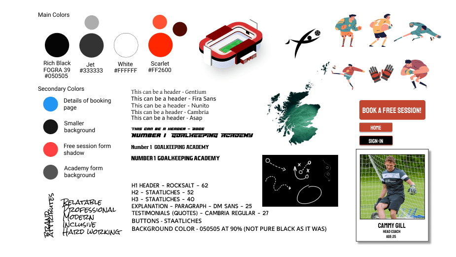
We had the first meeting with the Stakeholder and since the beginning the vibes were amazing; he left in our hands total freedom to desing, just respecting some parameters (colour scheme, logo and the most important sections to be displayed) and so we did. It was the Webpage of a local Goalkeeping Academy in Edinburgh and FIFE. The most specific among the specifics. Made with Wix.com and short knowledge of the Stakeholder in terms of desing (he is a professional goalkeeper, not a designer, totally normal), the Webpage wasn’t looking the best; not only aesthetically speaking but also in terms of what and how to display the important information to solve the biggest goal; attract new customers.
| ⚽ Product | Redesign of the webpage and prototype, responsive design and possible new features. |
| 🤔 Problem | The client is not able to attract new customers. Current customers are happy with the booking system but the webpage is not showing content attractive enough and the information is not displayed correctly. |
| 🐱💻 My Role | Re-design the whole UI and conduct all the UX processes. |
| ⏰ Project duration | 2 weeks; while completing Ironhack’s UX UI Bootcamp and as Final Project. |
| 👨🏫 Responsibilities | Conducting surveys, personal interviews, paper and digital wireframing, low, mid and high-fidelity prototyping, conducting usability studies, accessibility, and iterating on designs. |
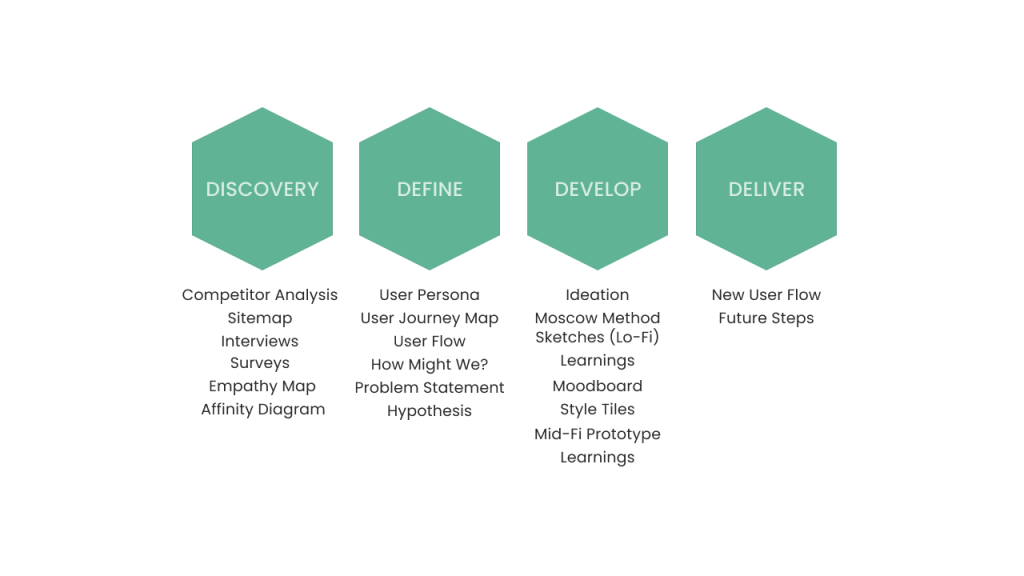
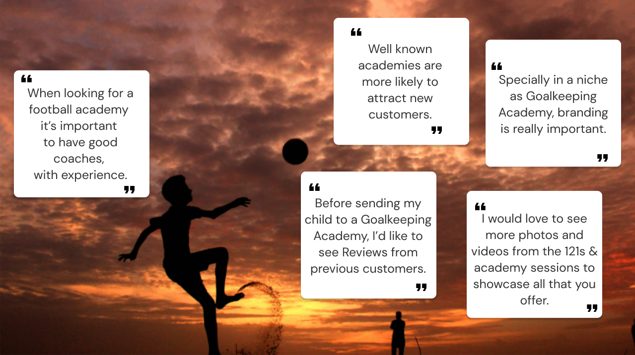
After conducting around 8 interviews and 3 surveys with more than 50 participants (we wanted to be sure about what we were doing and in this project the opinion of current users and potential users was really important) we collected important data that was useful to make changes that could allow us to make those changes we needed in order to achieve our goal.
The results were surprising; current users were happy with the website, specially with the booking system (something not on the webpage itself but managed in a different platform specialized in the booking of events). Also, the shop wasn’t a part very liked by customers and all of them considered that the gallery section should have a more important place. So we had a place to start, but it came with the personal interviews when we got the most important insights:
It was at that point when we realized that it was more a problem of branding and displaying the important information rather than a functional problem on the webpage itself. Then we started to do an exhaustive Competitor Analysis; we focused first of all in academies nearby that could suppose a direct competitor, and then we search in other countries, finding the best goalkeeping academies there to have inspiration and to learn from the best, which lead us to the Feature Competitor Analysis.
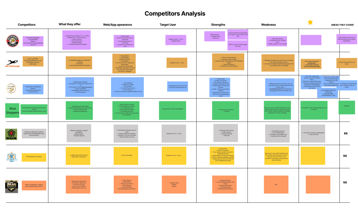
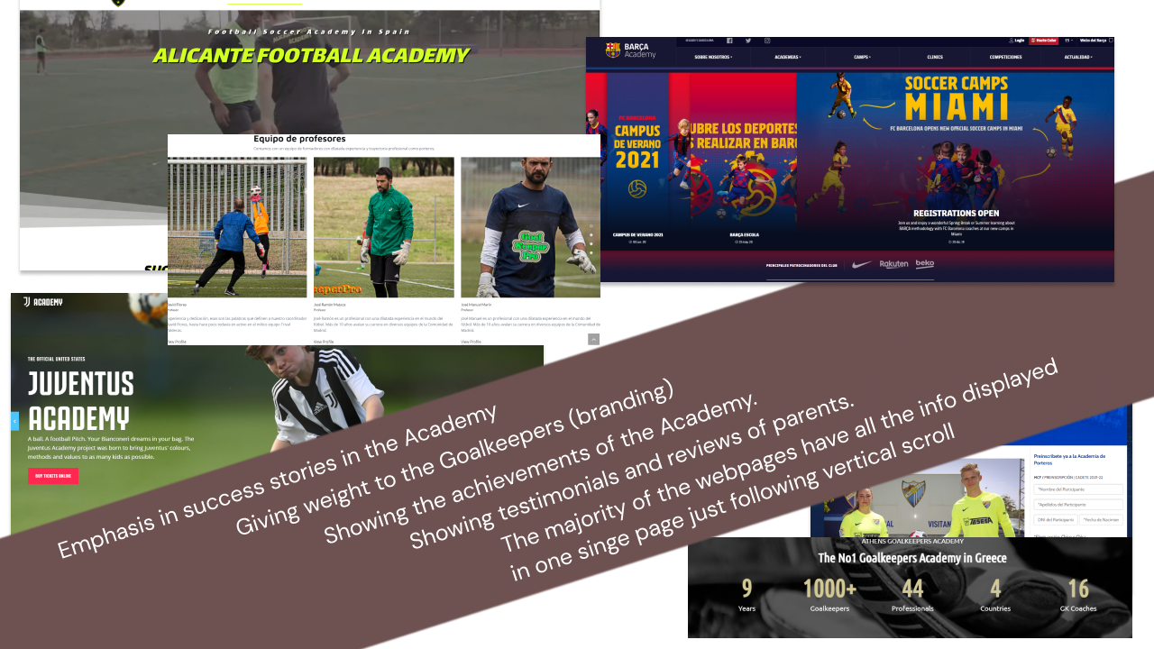
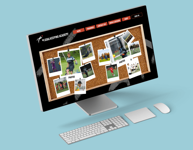
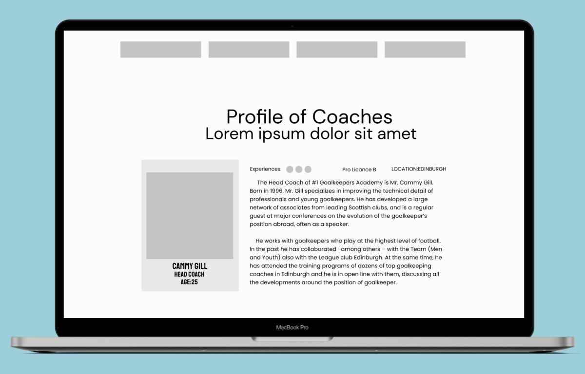
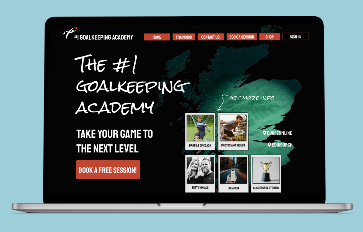
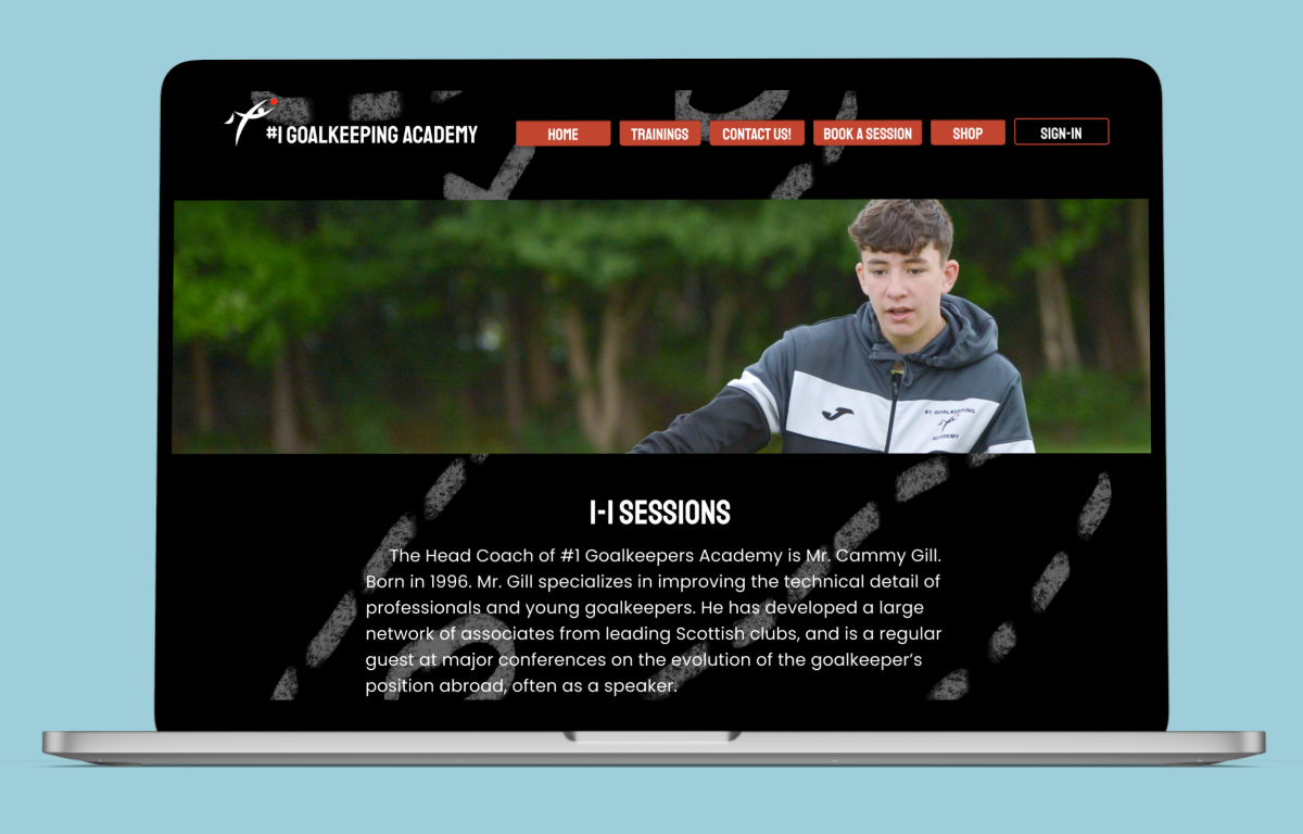
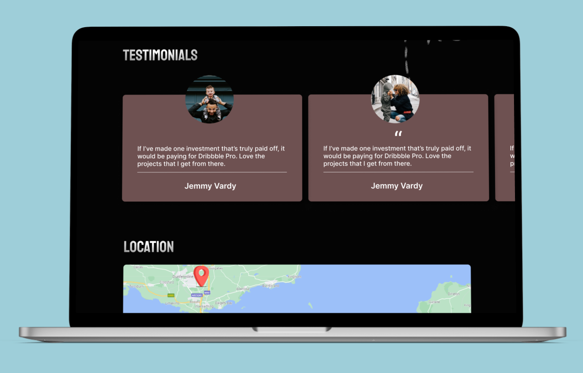
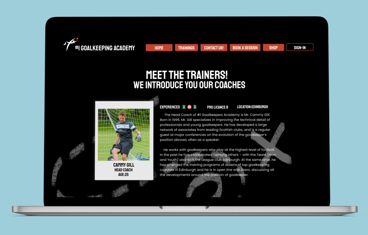
After these analysis we had somethig clear: we have to show off. Not taking literally the expression but the idea was that one: making us more visible showing what we have in the Academy, what we can offer and why we call ourselves “#1 Goalkeeping Academy”. So we followed what we have in the picture above: we need to emphasize our successes, branding the Goalkeepers (specially our Stakeholder, because it’s the visible face and the man in charge), to show achievements, testimonials and reviews from parents.
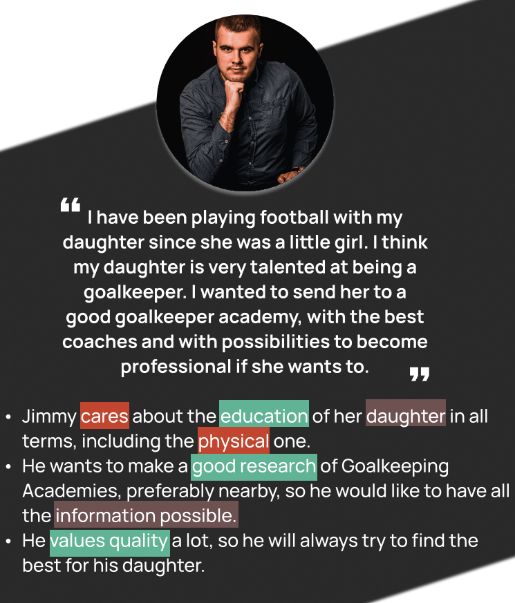
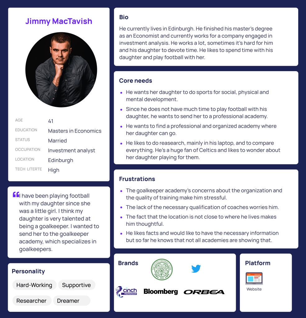
After this process, having some ideas already clear, we started to make the User Persona. At the beginning we wanted to make two user personas, one main one picturing a father that wants to find information about a Goalkeeping Academy around his area, and a child that is speaking with friends at school and starts thinking about going to a Football Academy but specifically for goalkeepers, as it’s what she really wants to do. But in this case the User Persona should be an hypothetical future user to make us able to find pain-points and opportunities in close rapport with targeted users.
So our only one archetype was Jimmy MacTavish:
After having clear the User Persona, it’s time to make the journey map, showing the main struggle that Jimmy would suffer in case of looking for a Goalkeeping Academy for his daughter in his area:
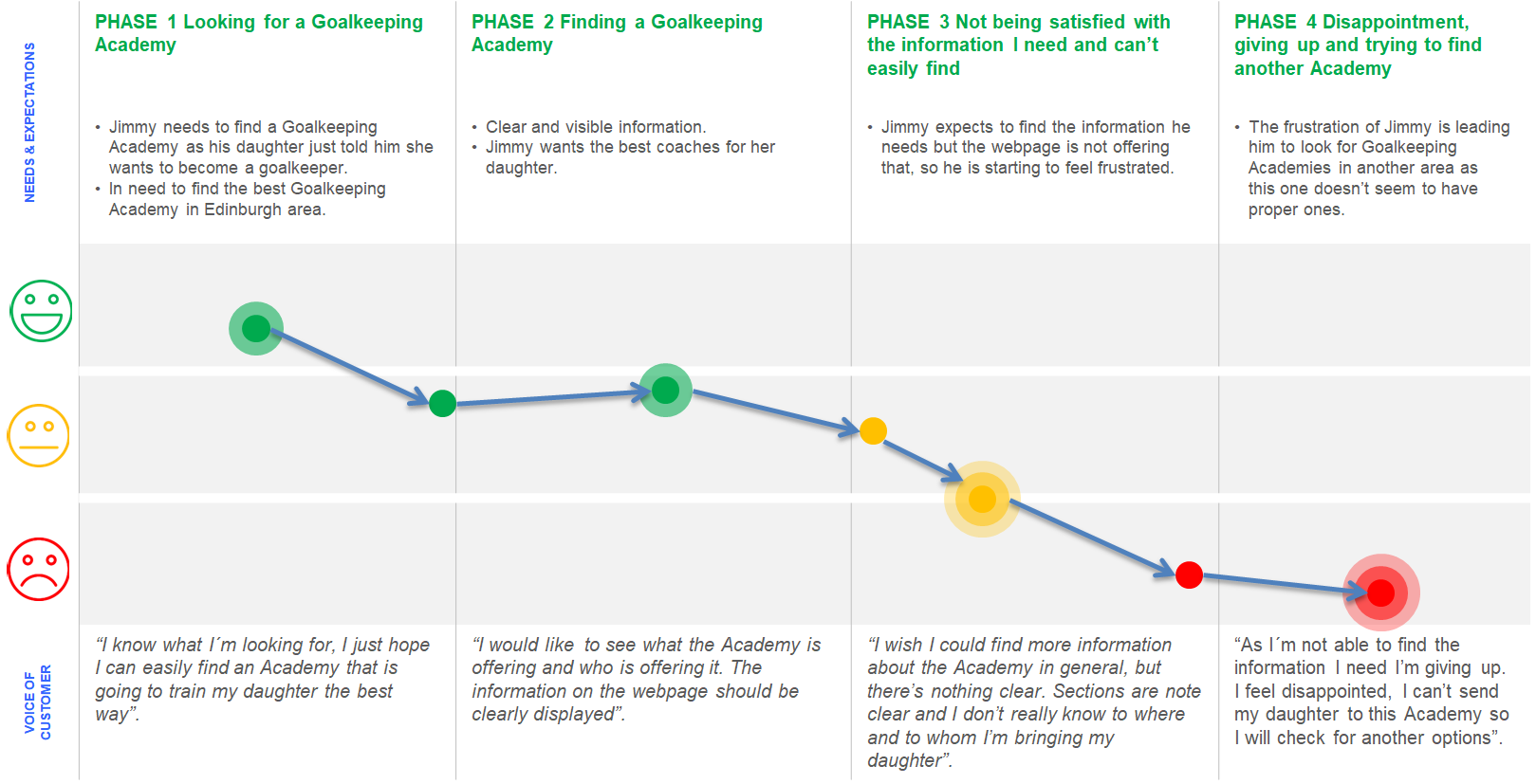
After identifying why our User Persona is frustrated, we created this Problem Statements:
Our users want to get information about goalkeeping academies,
but because of the lack of usability and laying out of contents they can not find the information they are looking for.
The information they find online is not enough and not well organized on the website.
Because of that, the website does not help to catch the attraction of new customers.
And then, we created the following Hypothesis Statement:
We believe that redesigning and rebranding the webpage for future clients will achieve a higher conversion rate.
We will know we are right when new people book sessions, engage with the Academy and share positive qualitative feedback.
How might we…
…make the webpage more attractive for new users?
…make users have more confidence in the academy?
…use media elements in a way that is more effective and attracts the attention of parents?
After having clear what we wanted to achieve according to the statements in our “How Might We” questions, we made the “Moscow Method” and we applied it to the first ideation of the prototype, made in paper.
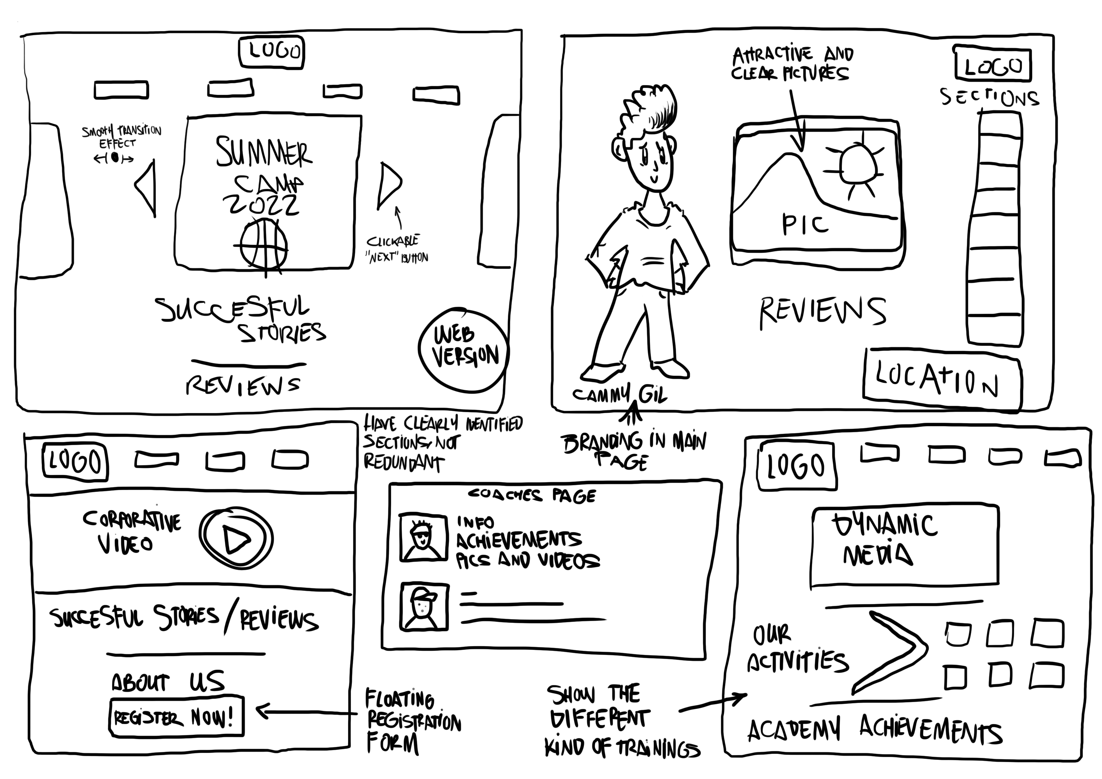
Low fidelity ideation, sketches made by hand.
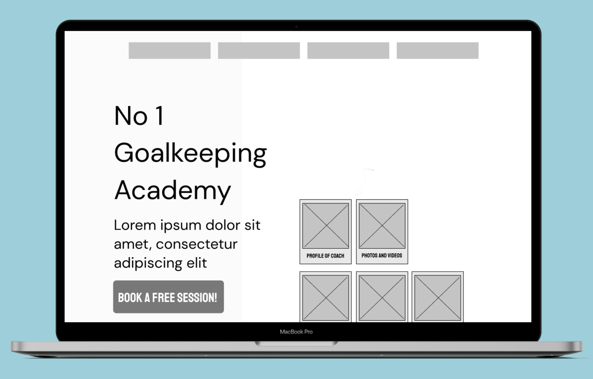
After many brainstorms and some surveys we starting giving form to the main idea, but we wanted to have inspiration from the best. Making a fast market research, you can easily find out who are the best around Europe training Goalkeepers specially, so we looked for some Academies in Spain and Italy, also to get some ideas for design. We found out that this kind of pages tend to be minimalistic and they have two things that we already thought about; Branding and showing. So for example, Iker Casillas Academy will have Iker Casillas himself on the main page, as well as Gianluigi Buffon. And what else they show? Children training. That’s what we had to show as well.
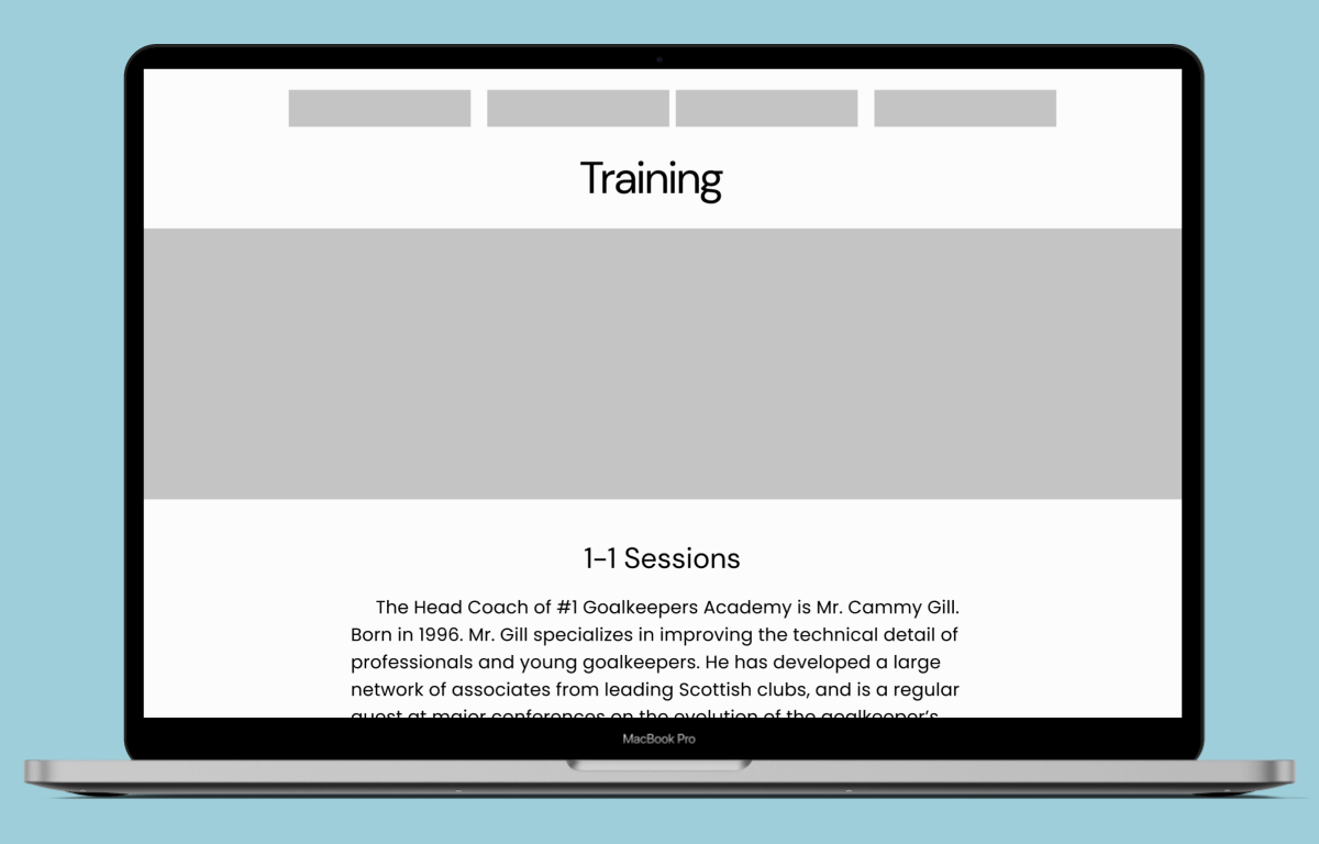
Then we started with our Mid-Fi wireframes and we tested them in Maze. The results we got were very important for us to be able to develop the prototype we created. (Click to see the image in detail 👇 )
Results from usability tests:
50% direct success
25% indirect success
25% gave up
63% found easily the information.
63% of the information was clearly displayed.
Some suggestions provided: Bigger headers.
After all the insights we received, we proceeded with the final version.
For the final test on Hi-Fi we counted with live testing from colleagues that gave us direct feedback:
- Header should be in Fix position.
- Bringing to Top button.
- Auto Shaking Polaroid (while hovering).
- Making more interactive components appearing on top.
NEXT STEPS:
Some suggestions that we gave to our stakeholder as well, since we were rewarded as designers with his agreeement and the decision to bring our design to life, were the following:
- Add “news” section.
- More detailde agenda.
- Coming up section for important upcoming matches.
- Hints and advisees to put in goalkeepers page.
- Trainings and simple exercises to do at home.